Use Your Office Design to Speak Volumes About Your Company
Perspectives
Design
If your office design or remodel doesn’t reflect who you are, what you do and why you do it, you’ve missed a valuable opportunity to market your company and your corporate culture to those who really matter – your clients and your staff. These are the people who promote your business and carry your story to others.
5 steps to a physical workspace that expresses your company culture
1. Identify your values
And list them. Core values attract customers and motivate employees, so it follows that your physical space should in some way demonstrate your values.
2. Think about your floor plan
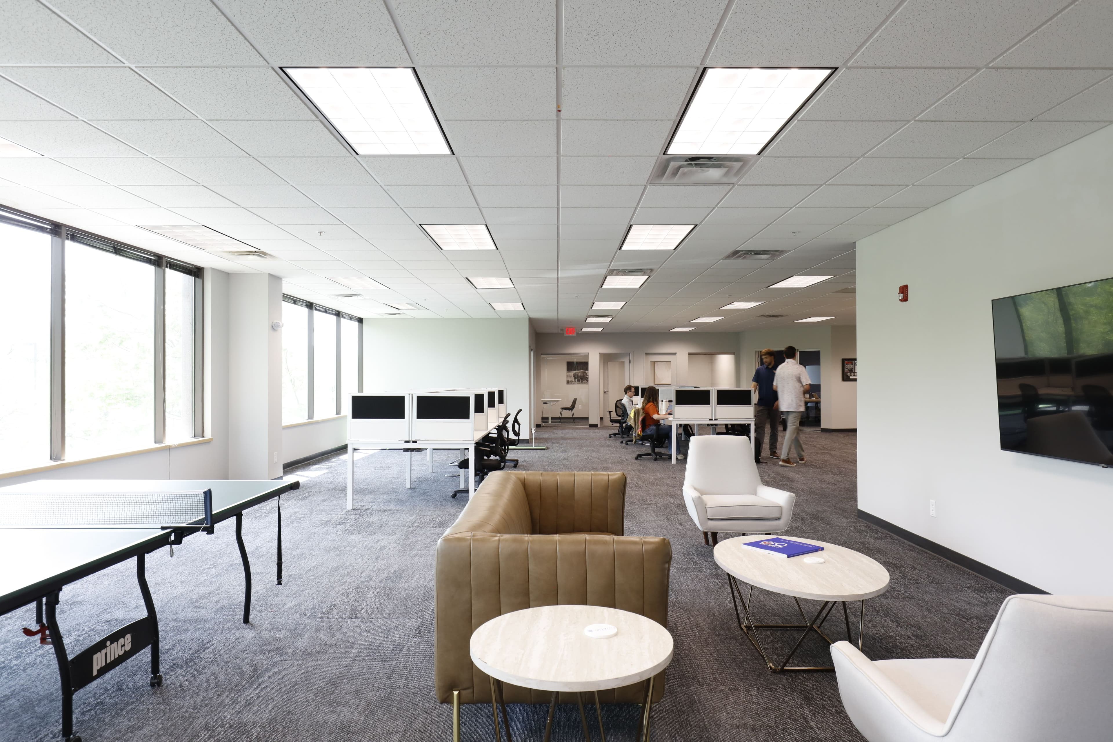
An open concept layout is a great way to emphasize your principles of honesty and integrity. This design also communicates a feeling of collaboration.
However, many, if not most businesses do have scenarios where privacy is important. Consider installing glass huddle rooms and meeting rooms with video conferencing screens. This facilitates confidential communication without disturbing others who need quiet to focus.
Where privacy is not such a concern, today’s furnishings and materials make it very easy to set up collaboration spaces in open areas with sound-absorbing screens and furniture. Adaptable workspaces are a cost-effective way to encourage growth and improvement in your company.
3. Research your materials
These don’t necessarily have to be the most expensive top-of-the-line products, but if your image is one of quality, don’t choose something cheap for your office remodel that’s going to look shoddy in a couple of months. Your customers should see and feel quality in the environment, and your employees will feel more motivated to deliver quality service in high caliber surroundings.
4. Your logo – a unifying whole
A lot of thought and skill has gone into your logo. So use it!
Your logo is the kernel of your brand, so it makes sense to expand on the rationale behind your logo design throughout your establishment.
According to the Gestalt theory, when we look at a group of objects, we see the whole before we see the individual parts. In fact the term Gestalt means a unified whole.
Does your logo tend towards curves, contours and ellipses? Make use of this design in your floor plan, traffic patterns and decorating.
Straight lines, squares and triangles impart feelings of strength, professionalism and integrity. Logo designs which include these patterns can be incorporated into your office design. And don’t be shy to display it as wall-art!
5. Choose your colors
Here again, look at your logo. If the colors are too deep, bold or bright to coat your whole office in, that’s just fine.
Opt for quieter, more subdued tones in general, but exploit your logo colors for accents, furnishings and trim.
Brand, business philosophy and core values are closely intertwined; – be sure to incorporate them into your new office fit out!
Our enthusiastic team will help you get it all together. Get in touch with us today.
Tom White
Partner
Related Articles

